ad: Annual 2024 Now Open For Entries!
*

Rebrand Roundup: From the Premier League to Vietnam

Published by

*Fable – Chen Nguyen

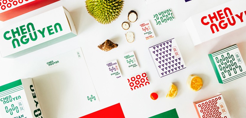
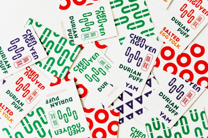
The Singapore-based consultancy Fable, has taken a simple design approach to a branding project for makers of Asian pastries, Chen Nguyen, which is distributed throughout Vietnam and China. Using elements inherent to the logotype, the letters “N” and “U” have been abstracted as basic shapes, and arranged in three ways to represent the three, flavours of pastry. So an oval shape represents durian fruit, a circle for salted egg, and a triangle for yam, with a mix of green, orange or purple accents also representing


This content is for members only

Click below to activate your Free Registration

Get Access

Already a member? Login here


Comments

More Leaders

*

Leaders

#Annual2024 – What the Judges want to see this year

After months spent sifting through some of the most creative work of the last year, Creativepool’s expert panel of judges are finally ready to pick the cream of the crop. This year’s expertly curated panel stands as our most diverse yet....

Posted by: Creativepool Editorial
*

Leaders

Are female board members more guilty of greenwashing?

With 72% of brands stating that one of their biggest fears is to be accused of greenwashing, Bec Peel looks at its impact on brands and how they can communicate sustainability issues with clarity. I’ve read a few reports recently on the...

Posted by: Continuous
*

Leaders

Regenerating London’s Commercial Quarter #BehindTheBrand

This week, we spoke to longtime Creativepool friend and SomeOne Founder Simon Manchipp, to discuss his agency’s visual identity for a bold new regenerative programme in London. What was the brief? Create a new comprehensive visual and verbal...

Posted by: Creativepool Editorial
ad: Annual 2024 Now Open For Entries!